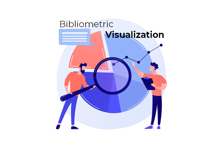
Visualize your search query results in ScienceGate using a variety of advanced, configurable, and flexible charts. Now, change the way you make sense of the information to create value out of it.
Search engines like ScienceGate deal with Big Data for providing service to the users. Therefore, graphic representation of data or the so-called Data Visualization is a very efficient way of communicating with the audiences. In this regard, ScienceGate has recently developed early access version of the Bibliometric visualization tool. In fact, this tool generates a mapping between the main data and graphical elements. This mapping decides how the graphical element attributions vary concurring to the original data.
This unique tool can now have many benefits for you as a student, researcher, professor, librarian, etc. For example, a researcher can discover trending and declining scientific topis by capturing trends and variations of different impact metrics (documents, citations, h-index, etc.) over time. The chart below indicates the number of published documents including the keyword “Artificial intelligence” over time. Can we call “Artificial intelligence” a trending topic?

Here, we will explain more how to use the ScienceGate Graph-Based Result Analysis tool including 12 configurable and flexible charts.
1. Bar Chart Race
Bar chart race helps you visualize the change in trends of a query field over time with animation.
To create a Bar Chart Race, you need to select a category and define the number of items to be included in your category. You also need to choose an indicator that you want to see the changes over time.
Indicator: Documents, Citations, H-index, 5-year H-index, 10-year H-index, Citations/Documents
Category: Source, Type, Year, Keyword, Publisher

2. Bubble Chart
Bubble charts help you visualize relationships between three data variables. A bubble Chart is an extension of a scatter chart in which the data points are replaced with bubbles, and an additional dimension of the data is represented by bubble size. Bubble Chart is a zoomable graph using two scrollbars.
To create a Bubble Chart, you need to select three indicators, a category, and the number of category items to be included in your result list.
Indicator: Documents, Citations, H-index, 5-year H-index, 10-year H-index, Citations/Documents
Category: Source, Type, Year, Keyword, Publisher

3. Clustered Column Chart
Column Chart is one of the most common and the easiest to read chart types when it comes to visualizing values with different categories. Rectangular bars are placed along the category axis with bar length representing an indicator value for a specific category. Clustered Column Chart helps you have column charts for several clusters in a single graph.
To create a Clustered Column Chart, you need to select an indicator, two categories, and the number of items to be included in both selected categories.
Indicator: Documents, Citations, H-index, 5-year H-index, 10-year H-index, Citations/Documents
Category: Source, Type, Year, Keyword, Publisher

4. Heat Map
Heat map represents data in a rectangular matrix where individual values are differentiated by color.
To create a Heat Map, you need to select a category and define the number of items to be included in your category.
Category: Source, Type, Year, Keyword, Publisher

5. Line Bar Chart
Line Bar Chart Mixing bar and line chart in the same visual is a good way to emphasize the difference between series while still maintaining their relationship.
To create a Line Bar Chart, you need to select two indicators, a category, and the number of items to be included in the selected category.
Indicator: Documents, Citations, H-index, 5-year H-index, 10-year H-index, Citations/Documents
Category: Source, Type, Year, Keyword, Publisher

6. Bubble Heat Map
You can visualize matrix data with bubble size variation using Bubble Heat Map. This chart is great to depict any kind of 3-dimensional data on an XY graph.
To create a Bubble Heat Map, you need to select an indicator, two categories for the chart axes, and the number of items to be included in both selected categories.
Indicator: Documents, Citations, H-index, 5-year H-index, 10-year H-index, Citations/Documents
Category: Source, Type, Year, Keyword, Publisher

7. Pie Chart
Pie Chart is used to represent data series as part of the whole. Each slice in a pie chart represents a data item proportionally to the sum of all the items in the series. The pie chart is one of the most widely used chart types but is widely criticized as its difficult for people to compare items in this circular shape.
To create a Pie Chart, you need to select an indicator, a category, and define the number of items to be included in your category.
Indicator: Documents, Citations, H-index, 5-year H-index, 10-year H-index, Citations/Documents
Category: Source, Type, Year, Keyword, Publisher

8. Radar Chart
Radar Chart is used to display a directional or circular visual representation of 2-dimensional data. This chart visualizes the share of the category items and the total (cumulative) value in circle slices. Radar Chart is a zoomable graph using two scrollbars.
To create a Radar Chart, you need to select an indicator, two categories for the chart axes, and the number of items to be included in both selected categories.
Indicator: Documents, Citations, H-index, 5-year H-index, 10-year H-index, Citations/Documents
Category: Source, Type, Year, Keyword, Publisher

9. Clustered Column Chart
Column Chart is one of the most common and the easiest to read chart types when it comes to visualizing values with different categories. Rectangular bars are placed along the category axis with bar length representing an indicator value for a specific category. Clustered Column Chart helps you have column charts for several clusters in a single graph.
To create a Clustered Column Chart, you need to select an indicator, two categories, and the number of items to be included in both selected categories.
Indicator: Documents, Citations, H-index, 5-year H-index, 10-year H-index, Citations/Documents
Category: Source, Type, Year, Keyword, Publisher

10. Tag Cloud
Tag Cloud helps visualize the weight or importance of an individual item from an item list.
To create a Tag Cloud chart, you need to select an indicator, a category, and define the number of items to be included in your category.
Indicator: Documents, Citations, H-index, 5-year H-index, 10-year H-index, Citations/Documents
Category: Source, Type, Year, Keyword, Publisher

11. TreeMap
TreeMap is a great way to represent the distribution of values among hierarchical categories in a clear and compact format.
To create a TreeMap chart, you need to select an indicator, two categories, and the number of items to be included in both selected categories.
Indicator: Documents, Citations, H-index, 5-year H-index, 10-year H-index, Citations/Documents
Category: Source, Type, Year, Keyword, Publisher

12. Radar Line Chart
Radar Line Chart is used to display a directional or circular visual representation of 2-dimensional data. Radar Line Chart is a zoomable graph using two scrollbars.
To create a Radar Line Chart, you need to select an indicator, two categories for the chart axes, and the number of items to be included in both selected categories.
Indicator: Documents, Citations, H-index, 5-year H-index, 10-year H-index, Citations/Documents
Category: Source, Type, Year, Keyword, Publisher

Simply click on the Results Analysis button on the search result page and enjoy the ScienceGate data visualization tool.


1 Comment